Show how to install the palmerpenguins package
install.packages("palmerpenguins")
library(palmerpenguins)Exercise 2
In this exercise, we will use descriptive statistics to describe datasets. We will also make some figures of the data. You can do everything using the R code blocks on the page. If you want to, you can also try run the code on your computer, but we will do that properly in the next exercise.
The palmerpenguins dataset contains data about some penguins. From the data website:
Data were collected and made available by Dr. Kristen Gorman and the Palmer Station, Antarctica LTER, a member of the Long Term Ecological Research Network.
The data has already been loaded into the R environment, but if you wanted to follow along on your own computer, you can load it by first installing the palmerpenguins package, and then loading the dataset.
palmerpenguins packageinstall.packages("palmerpenguins")
library(palmerpenguins)We are also going to use the tidyverse set of R packages for this exercise. They have also already been loaded, but as usual if you wanted to run this on your own computer, you would have to install and load the tidyverse package too.
tidyverse packageinstall.packages("tidyverse")
library(palmerpenguins)Ok, let’s get started.
First, we want to see what is in our dataset, which is an object named penguins. We can do that very easily, by simply calling it in R:
Once you click the “Run code” button, R will print the contents of penguins. Some objects have special behaviours when they are printed. This is one of those cases. Let me explain:
tibble. Tibbles are dataframes that act more like how we expect tables to act. They come from the tibble R package, which is installed with the tidyverse package.344) and number of columns (8).ℹ symbol:
ℹ tells us how many rows are not being shown here. Since by default 10 are shown, \(344-10=334\).ℹ tells us how many columns (variables) are not being shown here, as there was not enough room to print them. The variables sex and year have not been printed (note this might change depending on your screen size and browser).What else can we see from this output?
body_mass_g appears to be a continuous measure of mass in grams, with no decimal places (probably due to the accuracy of the equipment used), while species is a nominal categorical variable, assigning the species of penguin.NA (not applicable). This is the symbol R used for no data present. For example, the fourth row shows a penguin that has NA recorded for all the measurements, but its species and island were recorded (maybe it got loose before it could be measured?). We will encounter NA a lot in this course, as it is a feature of real data sets, and therefore you need to know how to deal with them. For now, lets just acknowledge that it is there.Next, use the glimpse() function to print the dataframe in a different way.
glimpse() transposes the dataframe, with columns now running down the page. This view means we can see all the variables. Again usually we would see the variable type, but the webR bug prevents this.
To get around that, we can temporarily use the following command (don’t worry about what this does for now, as glimpse() will work normally on your computers):
To see the number of categories in a factor column (or any other sort of variable actually), we can use the n_distinct() function in a similar way:
The above output tells us that there are 3 distinct values in the species column, and also in the sex and year column. An important thing to remember here is that NA values will be treated like a distinct value.
Now we can see all the data types and the number of unique values. Recall the R definitions from the previous exercise:
- Numeric: Represents numbers and can be either integers or floating-point numbers. For example,
42and3.14are numeric values.- Character: Represents text or string data. Character values are enclosed in quotes, such as
"Hello, world!".- Logical: Represents boolean values, which can be either
TRUEorFALSE.- Factor: Used to represent categorical data. Factors are useful for storing data that has a fixed number of unique values, such as “Species A” and “Species B” for species ID.
From the information we have found so far, can you assign a variable type to each of the columns? A reminder from the lecture:
- Categorical variables have a fixed number of discrete values
- The measurement we take will assign our data to a specific value
- E.g., species (Ischnura elegans, Lestes sponsa, Coenagrion hastulatum)
- Can be either nominal or ordinal:
- Nominal variables do not have inherent order (e.g., species)
- Ordinal variables do have an inherent order (e.g., “low”, “medium” or > “high” elevation)
- Quantitative variables are represented by numbers that reflect a magnitude
- Unlike categorical variables, the numbers we collect mean something tangible
- Can be either discrete or continuous:
- Discrete variables can only take certain values (e.g., a count of species must a natural number (1, 2, 3, etc), not 1.55)
- Continuous variales can take any real number (a number that can be represented by a decimal) within some range. (e.g., height in mm, temperature in °C)
Discuss the answers with your neighbour to see if you agree.
I struggle to get a good feeling over 300 rows of data by simply looking at it printed out. To help us understand the dataset better, we are going to make some simple plots.
R has a built in method to make plots, but we will avoid it in this course. Instead we will use ggplot2, a plotting package that is installed with tidyverse. ggplot2 provides a clear and simple way to customise your plots. It is based in a data visualisation theory known as the grammer of graphics (gg) (Wilkinson 2013).
Plotting at its most basic allows us to explore patterns in a dataset, such as looking for outlier and potential mistakes, visualising the distribution of individual variables and relationships betwee variables. Making good graphics/plots/figures (I will use these interchangably) is a bit of an art. We will touch on some best practises throughout this course.
The grammer of graphics gives us a way to describe any plot. ggplot2 then allows us to make that plot, using a layered approach to the grammer of graphics.
Using this approach, we can say a statistical graphic is a mapping of data variables to aesthetic attributes of geometric objects (Chester et al. 2025).
Wow. What does that mean? Let’s break it down.
A ggplot2 plot has three essential components:
data: the dataset that contains the variables you want to plotgeom: the geometric object you want to use to display your data (e.g. a point, a line, a bar).aes: aesthetic attributes that you want to map to your geometric object. For example, the x and y location of a point geometry could be mapped to two variables in your dataset, and the colour of those points could be mapped to a third.As I said before, ggplot2 uses a layered approach to the grammer of graphics. This makes it very easy to start contructing plots by putting together a “recipe” step-by-step. Let’s walk through an example.
We want to make a scatterplot that shows the relationship between body_mass_g and bill_length_mm. Imagine we are interested to see if bigger penguins also have bigger bills? (We will do correlation analysis later on in the course, this is just a nice example for learning ggplot2).
Let’s map out what we need to describe that plot:
data is the penguins dataset, as that is where the body_mass_g and bill_length_mm variables are.geom we are going to represent the data using a point, as we are making a scatter plot.aes is how we describe where each point should be. For this example, we could map the x (horizontal position) of the point to body_mass_g and the y position (vertical position) to bill_length_mm.So now we have the recipe, let’s start building layer by layer. First we will add the data by providing it to the ggplot() function as an argument. Try running this!
Wow, beautiful! But perhaps some things are missing. Let’s map our data. We use the aes() to tell R that everything inside it is going to be used as an aesthetic mapping, and that the names of the variables we mention come from the dataframe. We then provide that to ggplot()’s mapping argument, as shown:
Again, still not quite there. We need to actually show the data! We need to add some geometry. To do that we, use the + operator. While this is usually reserved for maths, ggplot2 hijacks it to add layers to a plot. We can add a point geometry like this (you might need to use the hoziontal scroll wheel to see the end of the first line):
Looking good! Notice you got a warning. The warning is important to pay attention to, as it is telling you that two rows (penguins) have not been plotted, as they contain missing values. These are the NA values we talked about earlier. Two penguins must have had an NA for at least one of our plotting variables, body_mass_g or bill_length_mm (as we need both to place the point).
Let’s add one more aesthetic to our data. Our dataset contained data for three different penguin species. Let’s map species to the colour of our points.
You need to modify the code above by adding a 3rd argument within the aes() function. In R, we seperate arguments within functions with a , as you can see between x = body_mass_g and y = bill_length_mm. Add another , then write colour = species. Then re-run the code.
1ggplot(data = penguins, mapping = aes(x = body_mass_g, y = bill_length_mm, colour = species)) +
geom_point()colour as a third aesthetic, mapped to species
You notice we now have a legend that tells us which colour is which species. ggplot2 has also chosen a default colour scheme for us.
Answer the following questions:
If someone told you that heavier penguins tend to have longer bills, and showed you this graph as proof, would you believe them? Why? Do you think this applies to all penguin species in the dataset?
Modify the code above to instead show bill_depth_mm on the x axis. Which penguin species do you think match each bill description?
Let’s get back to understanding each of the variables. For continuous variables, a histogram is a good place to start, as it shows us the range and the shape of the distribution. To make a histogram with ggplot, we use geom_histogram() as our geometry. geom_histogram() is a bit of a special geom_, as it does all the calculations needed to make a histogram for us, such as binning our data and counting the number of bits of data in each bin. We also need to only provide an x aesthetic value, and the y value is calculated for us by geom_histogram().
ggplot(data = penguins, mapping = aes(x = body_mass_g)) +
  geom_histogram()

1ggplot(data = penguins, mapping = aes(x = bill_length_mm)) +
  geom_histogram()

ggplot(data = penguins, mapping = aes(x = bill_depth_mm)) +
  geom_histogram()

ggplot(data = penguins, mapping = aes(x = flipper_length_mm)) +
  geom_histogram()

ggplot(data = penguins, mapping = aes(x = body_mass_g)) +
geom_histogram()x with the variable you want to plot.
Notice we get the warning again, that data (NA values) have been removed.
Copy and modify the above code to show the other continuous variables.
Now let’s look at our other variables. species and island and sex seem to be categorical nominal variables, each with three different categories. What about year? It’s integer data (1,2,3, etc) so that might suggest we should treat it like a quantitative discrete variable. But, it only has three levels across the entire dataset. This suggests to me that it instead is a categorical ordinal variable. It is the year the penguin was caught and measured. I think you could also make an arguement that this is not an ordinal variable, and instead is nominal. It would depend if you think penguins in 2007 are going to be more similar to penguins in 2008, than penguins in 2009 (maybe because of gradual changes in climate), or if you think any differences between years would be random (maybe some years are better or worse than others, but this is not predictable). Either way, we can also visualise it using the same method.
Let’s look at how much of our data comes from each category in each variable. To do that, we could use a bar chart. Like geom_histogram(), geom_bar() does some calculation for us. Specifically, it counts how many rows of data are assigned to each category, and then uses that for our y aesthetic.
# Part 1
ggplot(data = penguins, mapping = aes(x = species)) +
  geom_bar()

1ggplot(data = penguins, mapping = aes(x = island)) +
  geom_bar()

ggplot(data = penguins, mapping = aes(x = year)) +
  geom_bar()

ggplot(data = penguins, mapping = aes(x = sex)) +
  geom_bar()

# Part 2
2ggplot(data = penguins, mapping = aes(x = island, fill = species)) +
geom_bar()x with the variable you want to plot.
fill as an aesthetic, and map it to species.
island, sex, and year.aesthetic to make a plot that shows what proportion of the penguins on each island are which species? Are all species present on all islands?Hint: Instead of using colour, you might want to try fill. To understand why, try each one!
Finally for plotting today, we will make some box plots. Box plots allow us to visualize the distribution of a continuous variable and to compare distributions across different levels of a categorical variable. A box plot displays the median, quartiles, and potential outliers of the data.
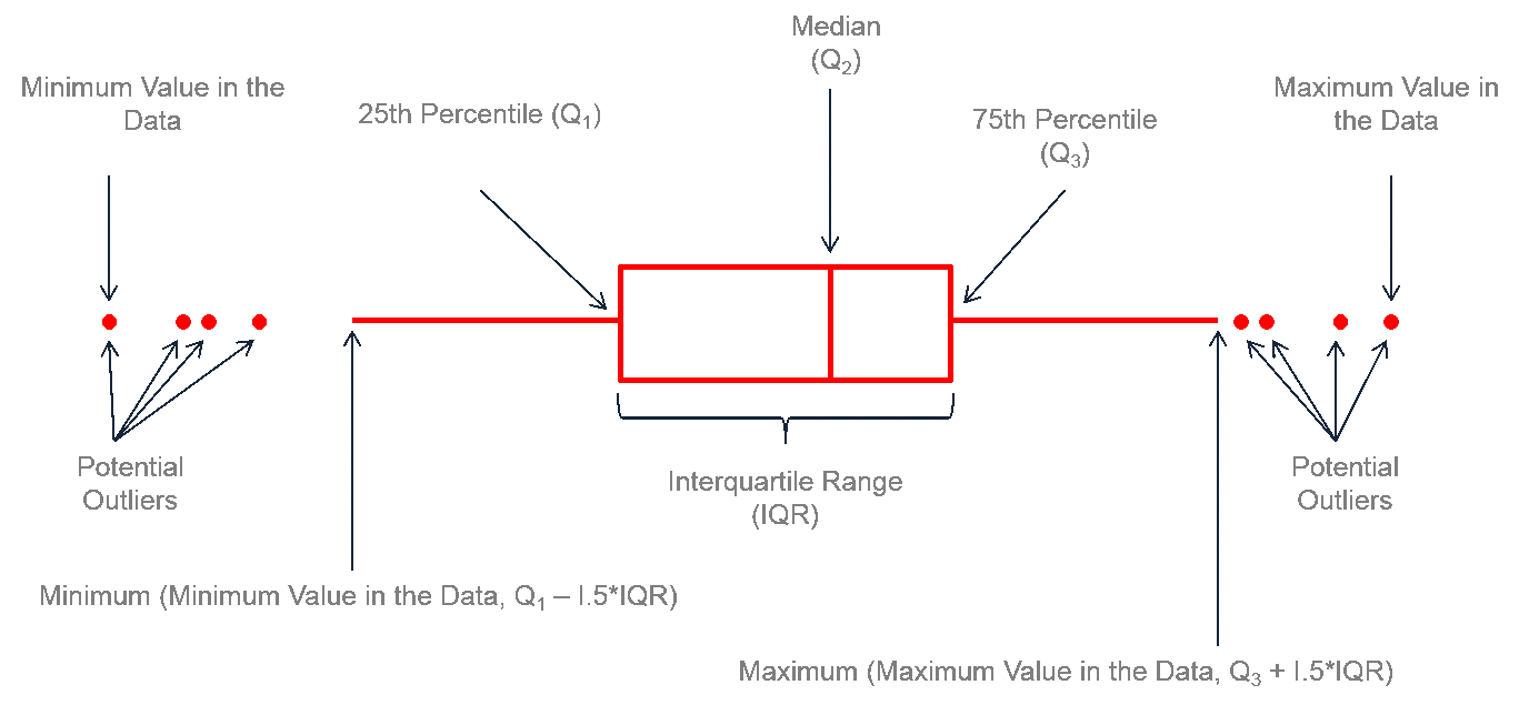
To create a box plot in ggplot2, we use geom_boxplot(). Again, this is a very helpful geom_, as it does all of the required calculations (median, quartiles, etc) for us.
Using what you have learned, try to create this boxplot yourself first (you can copy code from above and modify it). Create a box plot to compare body_mass_g across different species. Think what variables should be assigned to which aesthetics.
aesthetics.
geom function.
We will now calculate some of the descriptive statistics we covered in the lecture.
There are a few function in R that will quickly give an overview of the dataset. One of them is summary(), which when used on a dataframe, will provide some statistics about each variable in the dataframe:
Recall what quartiles (Qu.) are from the lecture. From this output, we can extract a number of descriptive statistics, including measures of central tendancy such as the mean, median, as well as measures of spread such as minimum, maximum and the 1st and 3rd quartiles, from which we could calculate the inter quartile range (\(\text{IQR} = Q_3 - Q_1\)).
Notice though that the outputs do not really make sense for year, since R is treating it as a quantitative variable, when we decided it should be a categorical variable.
We can fix that by changing the data type of the column to factor:
The mutate() function allows us to modify variables, or make new ones in the dataset. Here I overwrite the year variable (which was numeric) with a new version of year that is converted to a factor.
Once you’ve run the code above, try running summary again:
The year variable is now a more appropriate format, and gives us more useful information.
For all the descriptive statistics we covered in the lecture, you could calculate them using the maths functions alone from the last exercise. However, they have also been implemented in their own functions, which saves us some time:
mean(): Computes the arithmetic mean of a numeric vector.median(): Computes the median of a numeric vector.min(): Returns the minimum value in a numeric vector.max(): Returns the maximum value in a numeric vector.quantile(): Computes the quantiles of a numeric vector.
quantile(x, prob = 0.25), where x is a numeric vector.quantile(x, prob = 0.75), where x is a numeric vector.var(): Computes the variance of a numeric vector.sd(): Computes the standard deviation of a numeric vector.length(): Count the number of bits of data in a vector.Note that most of these function, by default, will produce an error if you have a single NA in the vector. If you use a vector with NA values, you need to explicitly tell the function to remove the NA values, by adding the argument rm.na = TRUE.
You’ll notice that each of these take a vector as input (check the last exercise for a review). Each column/variable in our dataframe penguins is actually just a vector. So we can use these functions on individual columns. To do that, we need to extract the column/variable we are interested in, then use the statistic function on it. For example, to calculate the mean of the variable flipper_length_mm, we could write it like this:
To break down what’s going on here. 1. On the first line, we write the name of the dataframe that contains the variable we want to use. 2. This is then piped |> into the next line, where we use pull() to “pull out” the variable we want. 3. We then again use a pipe |> to send that to the mean() function. Since bill_length_mm contains some NA values, we need to put na.rm = TRUE (NA remove) inside mean().
Use what we have learned above to complete the following exercises by filling in the blanks:
Calculate the median of body_mass_g:
penguins |>
  pull(body_mass_g) |>
  median(na.rm = TRUE)
Calculate the standard deviation of bill_length_mm:
penguins |>
  pull(bill_length_mm) |>
  sd(na.rm = TRUE)
Calculate the 1st quartile of bill_depth_mm:
penguins |>
  pull(bill_length_mm) |>
  quantile(prob = 0.25, na.rm = TRUE)
Calculate the IQR of body_mass_g:
first_quartile <-
  penguins |>
  pull(body_mass_g) |>
  quantile(prob = 0.25, na.rm = TRUE)

third_quartile <-
  penguins |>
  pull(body_mass_g) |>
  quantile(prob = 0.75, na.rm = TRUE)

third_quartile - first_quartileOften we want to provide a table of descriptive statistics about our variables. To make our own (beyond what summary() can offer), we need to do a bit of data manipulation. To do that, I need to introduce a few functions from the package dplyr (part of tidyverse), which provides a grammer of data manipulation for us to use. Again, like ggplot2, this grammer is often much easier for non-programmers to understand, and makes doing common tasks easier for everyone.
In this next section, we will use the following functions:
group_by: all functions that come after this will provide an output for each category in the grouping variable.summarise(): produces a summary table by computing summary statistics on a variable.Let’s start by constructing a table that will describe the bill_length_mm variable, but we want to compute the statistics for each penguin species. On the first line we write the dataframe name, penguins, which we then pipe |> into the next line. On the second line, we tell R to remove all penguins that have an NA for their bill length. This saves us from needing to write na.rm = TRUE many times. This gets piped |> into the next line, where we specify our grouping variable, which in this case, is species. When then use another pipe |> to send that onto the next line, where we will use summarise() to make a summary table. Inside summarise() we define what summary statistics we want to calculate, and what we want to call them in the output. For example, here we calculate the mean() of bill_length_mm, and tell the function to call it mean_bill_length_mm in the output.
The output contains our new mean_bill_length_mm column, but for each penguin species. We can add other new columns with other descriptive statistics in a similar fashion. Note that instead of making the 4th line very long, we can put new arguments on seperate lines, as long as those lines end with a comma:
penguins |>
3  drop_na(bill_length_mm, sex) |>
2  group_by(species, sex) |>
  summarise(
    mean_bill_length_mm = mean(bill_length_mm),
1    median_bill_length_mm = median(bill_length_mm),
    sd_bill_length_mm = sd(bill_length_mm)
)Add another column to the output table above that calculates the standard deviation of bill_length_mm.
We can add more than one grouping variable, by simply listing it within group_by(). For example, try grouping your output by both species and sex. Note that this produces an potentially unwanted group, how could you get rid of it?
We will now walkthrough how we might go about answering a research question using a basic version of the scientific method (which we will cover in full in a lecture on Thursday).
Sexual dimorphism is the condition where sexes of the same species exhibit different morphological characteristics, including characteristics not directly involved in reproduction. Differences may include size, weight, color, markings, or behavioral traits.
From this definition of sexual dimorphism above, we will try and address the following question:
Is [chosen penguin species] sexually dimorphic?
You should choose one penguin species to work with (Adelie, Chinstrap or Gentoo).
Before beginning any scientific study, we need a hypothesis, for two reasons. The first is practical: if you do not have a hypothesis in mind, you’ll likely not collect data in an effective manner and you will waste your time. The second is more fundamental: all statistical tests are based on testing a hypothesis. So, to meaningfully conduct a statistically test, you need a hypothesis.
The hypothesis is an explanation for your data. Two types exist:
sex) has no effect on our data.sex) does affect our data.Using the above examples, can you phrase both the null and alternative hypotheses?
Usually this is the stage where you would design an experiment to test your hypothesis. You need to think what is the population you want to make inferences about, and what would be an appropriate sample to do so.
For this exercise, assume that the penguins data is a representative sample (collected randomly) of your chosen species. What is the population we can then make inferences about?
Before we go any further, we should create a subset of our data that is just your chosen penguin species, as that is the population we want to make inferences about here. We can use filter() to make a “filter” for our data. Only rows that satisfy our conditional statement will be allowed through the filter. Replace ______ with the name of your chosen species. We are also only interested in rows where we have information about the penguin’s sex. We will also remove the rows with NA for sex using some logic from exercise 1. Run the code below, and going forward, we should use the my_species dataframe.
You also should decide what variable(s) you will use to assess sexual dimorphism. Now, by copying and modifying code from previous sections, calculate the mean and standard deviation of that variable for each sex.
Make a plot that shows you chosen variable for each sex. Again, copy and modify code from above.
We now want to test if these means (from a sample) likely differ between sexes in our population.
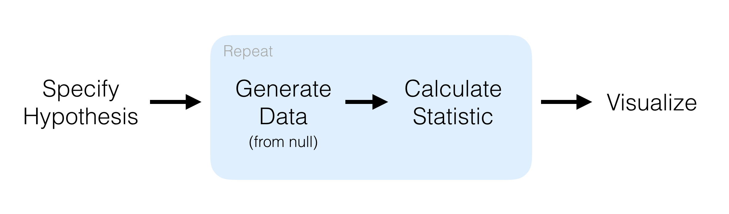
One way we can do that is to start by imagining the world in which our null hypothesis is true. In that world, there is no difference between the sexes in your chosen variable. In that world, a penguin being labelled as male or female should have no effect on your chosen variable. In otherwords, if our null hypothesis is true, then randomly assiging sex to each penguin should not alter the difference in means between the sexes.
This idea is the foundation of a type of statistical inference called permutation or randomisation testing.
Let’s try implement it here. To do that, we will use the R package infer (which I have already loaded).
infer designFirst, we need to specify() which variables are relevant to our hypothesis. This extracts the data we need to test our hypothesis. We then calculate() the "diff in means", specifying that we want to get the difference as male-female. A positive value therefore indicated male biased sexual dimorphism. Fill in the variable you have chosen and run the code:
Next, we need to state our null hypothesis. In this case, our null hypothesis is that the explanatory variable sex has no effect on the response variable. Therefore, we hypothesize() (if the null is true) "independence" between the explanatory and response variables.
my_species |>
  specify(response = ______, explanatory = sex) |>
  hypothesize(null = "independence")
Now, we need to randomly shuffle the sex variable, which if our null hypothesis is true, should have little affect on the difference in means. We also need to do this a lot of times (1000+). First we generate() 1000 datasets where the sex variable has been randomly shuffled ("permute"). Then in each of those datasets, we calculate() the difference in means between the sexes, as we did for our deal difference in means above. Fill in the variable you have chosen and run the code:
Now, let’s visualise our null distribution null_diff_means.
This shows the distribution of values of sexual dimorphism we could observe if the null hypothesis was true.
We can use the position of the real calculated difference between the sexes in the null distribution to infer how likely our null hypothesis was true. If the null hypothesis is true, then our real difference will probably lie somewhere near the middle of our null distribution, as after all, sex had no effect on the chosen variable.
However, if sex did have an effect on the chosen variable (that is, our alternative hypothesis was correct), then we would expect the original sex assignments to be a very special arrangement. As such, our real difference should lie close to the tails of the null distribution (or maybe far beyond it).
Let’s plot it now to see. We can use the function shade_p_value() to do this (we will come back to what a p-value is later). We specify the direction = "two-sided" because our hypothesis did not make an assumption as to if the sexual dimorphism will be male or female biased.
Where did your real difference in means end up? Use the above text to decide if you think your null hypothesis, or your alternative hypothesis, is most likely true.
Finally, phrase your findings in biological terms. What do your findings suggest?
When you are done, show the teacher your findings.