library(tidyverse)Reproducible analyses in R
Exercise 3
Get RStudio setup
Each time we start a new exercise, you should:
- Make a new folder in your course folder for the exercise (e.g.
biob11/exercise_3) - Open RStudio
- If you haven’t closed RStudio since the last exercise, I recommend you do so and then re-open it. If it asks if you want to save your R Session data, choose no.
- Set your working directory by going to Session -> Set working directory -> Choose directory, then navigate to the folder you just made for this exercise.
- Create a new Rmarkdown document (File -> New file -> R markdown..). Give it a clear title.
We are now ready to start.
Tephritis phenotype
Study background
Today we will work with a dataset called tephritis_phenotype.csv. The dataset comes from a study conducted at Lund University by Nilsson et al. (2022).
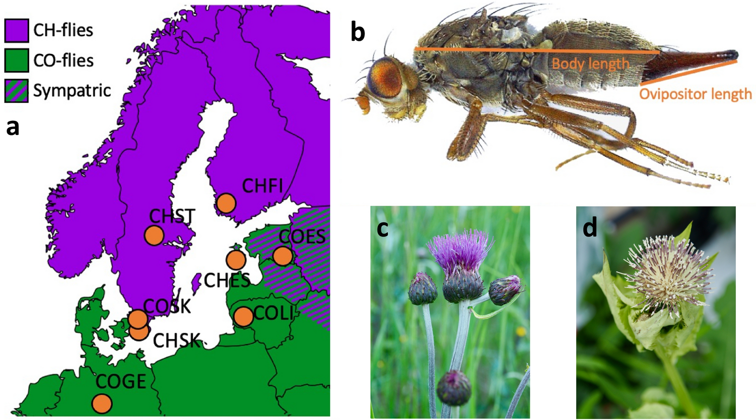
The dataset describes morphological measurements of the dipteran Tephritis conura. This species has specialised to utilise two different host plants (
host_plant), Cirsium heterophyllum and C. oleraceum, and thereby formed stable host races. Individuals of both host races were collected in both sympatry (where both Cirsium heterophyllum and C. oleraceum host plants co-occur) and allopatry (where only one Cirsium species occurs) (patry) from eight different populations in northern Europe (region) from both sides of the Baltic sea (baltic). Individuals were measured after having been hatched in a common lab environment. One female and one male (sex) from each bud was measured. The authors took magnified photographs of each individual, and of the wings of each individual.
Measured traits included wing length (
wing_length_mm), wing width (wing_width_mm), melanised percentage cover (melanized_percent), body length (body_length_mm) and ovipositor length (ovipositor_length_mm). Body length and wing measurements were collected by measuring images digitally. Wing melanisation was measured using an automated script, which quantified how many pixels of the wing was melanised.
Note✅ Task
- Download the dataset from Github.
- Move the downloaded
tephritis_phenotype.csvfile to your working directory folder.
Load R packages
In this exercise, we will use the tidyverse package.
Importing data
We will now load the tephritis_phenotype.csv data file that you downloaded earlier. A .csv file is a file that stores information in a table-like format with Comma Separated Values. A typical .csv file will look something like this:
species,height,n_flowers
persica,1.2,12
persica,1.5,18
banksiae,2.4,3
banksiae,1.7,8
.csv files are especially suited to storing data that can be used across a wide variety of programmes, as everything is stored as plain text.
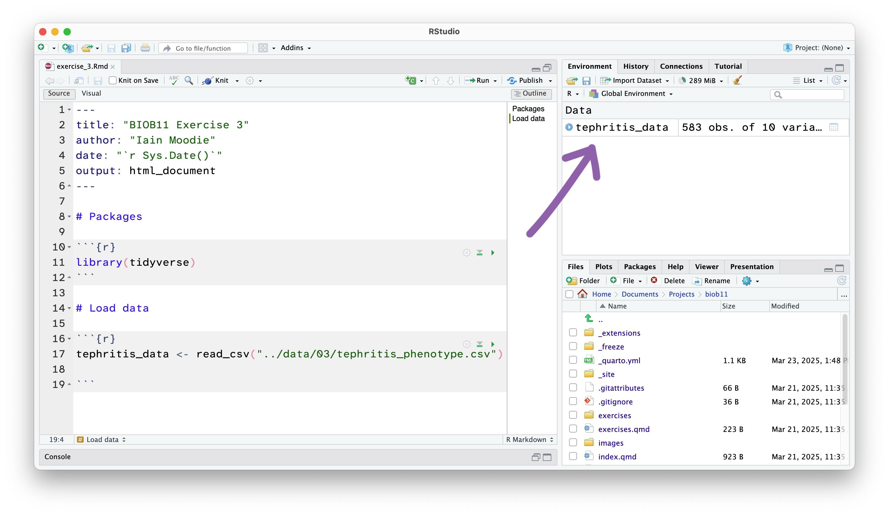
This has loaded a copy of the data from tephritis_phenotype.csv into R. Notice that the object tephritis_data has also appeared in the Environment panel.
Exploring data
Getting a general overview
This will open the dataset using the RStudio function View() (which if you look in your console, you will see it has just run). This allows you to view the dataset as a table, like you would in a spreadsheet software like Microsoft Excel. Note however, there is no way to edit the data in this view. This is by design. Any editing of the data needs to be done in the RMarkdown document with code. That way, you can keep a record of any edits you make, without touching the original data file.
Finding mistakes
Datasets can often be messy. People make mistakes entering data all the time. You should check this dataset for potential errors. For a reference, these flies are very small, less than 1 cm in size.
Filtering out mistakes
We will use the filter() function to remove rows that contain improbably values. filter() let’s us write conditional statements that only allow rows that meet those conditions to “filter” through. For example, we could use filter to remove all rows where wing_length_mm is greater than our guess at what the maximum should be.
- 1
-
Assign the cleaned data to a new object, called
clean_data. - 2
-
We pipe
|>the data into thefilter()function - 3
-
This will only let though rows that have a
wing_length_mmless than<_____ - 4
-
You can add more
filter()functions as you wish.
This is an example of a data processing “pipeline”. It is a list of step-by-step instructions that clearly document what we did to get, in this case, a clean dataset.
Descriptive statistics
We will now calculate some of the descriptive statistics we covered in the lecture (beyond what is calculated by the summary() function). Remember, we want to work with the cleaned dataset from now on (clean_data).
Contingency tables
Recall that contingency tables show how often certain cases (combinations of categories) are found in a dataset. Here, we will use the count() function to produce a contingency table. For example, to create a table showing the number of rows from each region, we can write:
Pivot tables
Pivot tables are summary tables that work with anything other than frequency of cases. We will now build sets of data summarising pipelines to produce tables of summary statistics.
For example, if we want to create a table that shows the mean and standard deviation of wing_length_mm for flies from each region, we can write:
- 1
-
We pipe
|>the data into thegroup_by()function. - 2
-
All functions that come after
group_by()will provide an output for each category of the grouping variables. - 3
-
summarise()allows us to calculate summary statistics on the dataset, respecting the groups defined bygroup_by() - 4
-
Inside
summarise()we define what summary statistics we want to calculate, and what we want to call them in the output. - 5
-
Note we are still inside the brackets of
summarise(), so we separate each arguement with a comma,. - 6
-
We close the brackets of
summarise().
Making plots
R has a built in method to make plots, but we will avoid it in this course. Instead we use ggplot2, a plotting package that is installed with tidyverse. ggplot2 is based in a data visualisation theory known as the grammer of graphics (gg) (Wilkinson 2013).
The grammer of graphics
The grammer of graphics gives us a way to describe any plot. ggplot2 then allows us to make that plot, using a layered approach to the grammer of graphics.
Using this approach, we can say a statistical graphic is a mapping of data variables to aesthetic attributes of geometric objects.
Wow. What does that mean? Let’s break it down.
A ggplot2 plot has three essential components:
data: the dataset that contains the variables you want to plotgeom: the geometric object you want to use to display your data (e.g. a point, a line, a bar).aes: aesthetic attributes that you want to map to your geometric object. For example, the x and y location of a point geometry could be mapped to two variables in your dataset, and the colour of those points could be mapped to a third.
For example, to look at the relationship between body_length_mm and wing_length_mm we can construct a ggplot recipe as follows:
We start by specifiying the data we want to plot.
1clean_data |>
ggplot() - 1
-
We could have also written
ggplot(data = clean_data)orggplot(clean_data), but let’s use pipes|>to keep things consistent.
Next we can specify our aesthetics. We do that by writing the aes() function inside the ggplot() function.
clean_data |>
1 ggplot(aes(x = body_length_mm, y = wing_length_mm))- 1
-
Anything we write inside the
aes()function will map data to our plot.
And finally we add our geometry, in this case a geom_point().
clean_data |>
1  ggplot(aes(x = body_length_mm, y = wing_length_mm)) +
geom_point()- 1
-
Note that
ggplot2uses+to add layers to a plot, not the|>operator.
Save your RMarkdown file!
Make sure you save your RMarkdown file regularly.
Analysis
To finish today’s exercise, you will use what you have learned to try and answer a research question. Any method or approach you think is valid is fine here. We will cover on Friday how to formally approach these questions.
Knit your document
For your final task, you should “knit” your document into a HTML file. When you knit your document, RStudio:
- Executes code chunks: all R code embedded in your document runs in sequence
- Embeds results: output (tables, plots, numbers) is inserted into the document at the location of each code chunk 3, Processes markdown: markdown formatting (headers, bold, links, etc.) is converted to the output format (so it looks like the visual mode)
- Generates output file: a single document is created with all code, results, and formatted text combined
This document is ideal for presenting to other people, as it contains all your notes, code and output, without the other person needing to run your code.
Note✅ Final task
Knit your document to a HTML file.
It will have been saved next to wherever your .Rmd file is saved.
Upload your .html file as your assignment for this exercise in Canvas.
References
Nilsson, K. J., M. Tsuboi, Ø. H. Opedal, and A. Runemark. 2024. Colonization of a Novel Host Plant Reduces Phenotypic Variation. Evolutionary Biology 51:269–282.
Nilsson, K., J. Ortega, M. Friberg, and A. Runemark. 2022. Morphological measurements of two host specialists of the dipteran Tephritis conura, both in sympatry and allopatry. Dryad.
Wilkinson, L. 2013. The Grammar of Graphics. Springer Science & Business Media.