Tests of, and associations between, categorical variables
Exercise 8
Author
Iain R. Moodie
Published
April 3, 2025
Get RStudio setup
Each time we start a new exercise, you should:
Make a new folder in your course folder for the exercise (e.g. biob11/exercise_8)
Open RStudio
If you haven’t closed RStudio since the last exercise, I recommend you do so and then re-open it. If it asks if you want to save your R Session data, choose no.
Set your working directory by going to Session -> Set working directory -> Choose directory, then navigate to the folder you just made for this exercise.
Create a new Rmarkdown document (File -> New file -> R markdown..). Give it a clear title.
Please ensure you have followed the step above before you start!
Species co-occurences in benthic communities
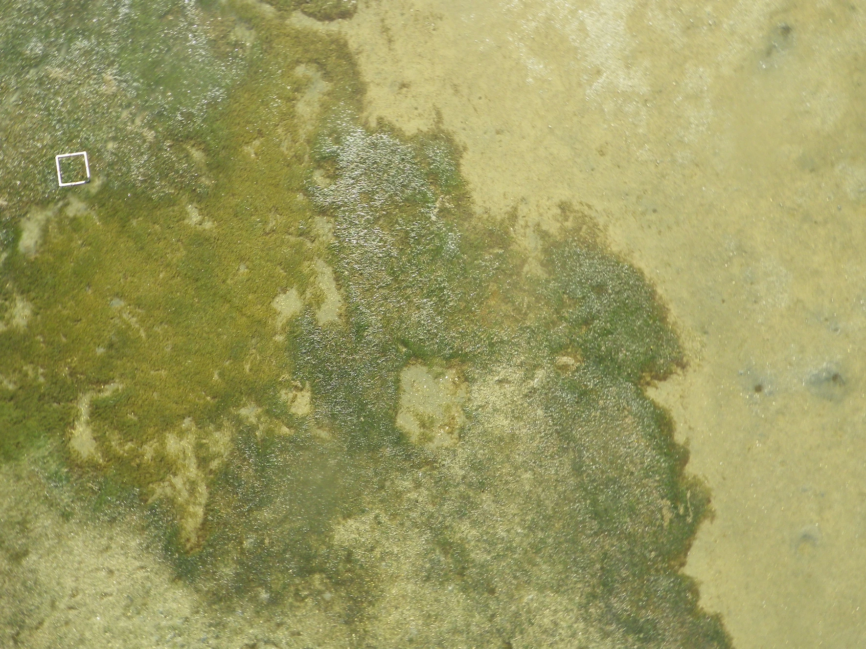
An illustration of the visual contrast between seagrass meadows (left hand side) and bare sediment sandflats (right hand side). Picture taken by Roman Zajac at Kaipara harbour, New Zealand. The white rectangle encompasses 0.5 × 0.5 m
Co-occurrence patterns of species across a landscape may arise due to shared habitat preferences, dispersal patterns, community interactions (e.g. facilitation, competition) or the interaction of these processes. To understand if communities differ in species composition and/or abundance between open sand and sea grass habitats in a shallow bay, researchers conducted snorkling transects and recorded the number of 6 important benthic species.
The data the researchers collected can be found here.
Analysis
While working on your analysis, answer the questions below:
General
What (statistical) population are the researchers trying to make inferences about?
Data handling and plotting
Ensure you have loaded the tidyverse and infer packages.
Import the dataset using read_csv().
What sort of variables are species and habitat?
Check the data for mistakes.
Make an illustrative plot of the dataset using ggplot().
Descriptive statistics
Report the following statistics:
The proportion of each species that are found in each habitat.
Are certain species associated with certain habitats
The researchers want to know if some species are much more likely to be found in one habitat than another, or are they randomly spread across the bay.
Specify which is your response and explanatory variable.
3
The specific test statistic we want to use requires us to provide our null hypothesis. In this example, we want to know if the two variables are associated, so our null hypothesis is that they are independent.
4
Calculate the observed statistic.
5
Print the observe statistic to the console.
To generate a null distribution, we can use a permutation approach, where we shuffle the assigned categories and calculate our statistic many many times. Generate a null distribution.
Specify which is your response and explanatory variable.
3
Our hypothesis is that our response variable is independant of our explanatory variable.
4
Simulate data using permuations. This may take a few seconds to minutes depending on your computer.
5
From each of our simulated permutation samples, calculate the test statistic.
Plot the null distribution and the observed statistic.
Code hint
null_dist |>1visualise() +2shade_p_value(obs_stat = observed_statistic, direction ="greater") +3labs(x ="______ statistic")
1
Pipe your null_dist object into visualise().
2
Plot your observed_statistic, and specify that the direction should be greater. Our statistic is squared, so is naturally bounded at 0.
3
You can change the axis labels to make the plot more clear.
Use your observed statistic and your null distribution to calculate a p-value.
Code hint
null_dist |>get_p_value(obs_stat = observed_statistic, direction ="greater")
What are your conclusions? State them in terms of your null hypothesis, and in a more general statement.
Has public opinion changed since the last election?
In the last general election, the red party recieved 38% of the vote, the blue party recieved 34% of the vote, the green party recieved 18% of the vote, the yellow party recieved 8% of the vote, and the purple party recieved 2%.
Party
Vote Percentage in Last Election
Red
38%
Blue
34%
Green
18%
Yellow
8%
Purple
2%
In a recent opinion poll, 300 people were asked who they would vote tomorrow if there was an election.
The data from that opinion poll can be found here.
Analysis
While working on your analysis, answer the questions below:
General
What (statistical) population are the researchers trying to make inferences about?
Data handling and plotting
Ensure you have loaded the tidyverse and infer packages.
Import the dataset using read_csv().
What sort of variables is party?
Check the data for mistakes.
Make an illustrative plot of the dataset using ggplot(). Can you show the expected values on the plot as well?
Descriptive statistics
Report the following statistics:
The proportion of the people surveyed who said they would vote for each party.
The specific test statistic we want to use requires us to provide our null hypothesis. In this example, we want to know if the proportion of each group in the response variable is different from a hypothesised proportion, so we use point.
4
Here we need to put in our expected or hypothesised proportions under the null hypothesis.
5
Calculate the observed statistic.
6
Print the observe statistic to the console.
To generate a null distribution, we can draw from a probability distribution defined by our hypothesize() step.
In this example, we want to know if the proportion of each group in the response variable is different from a hypothesised proportion, so we use point.
4
Here we need to put in our expected or hypothesised proportions under the null hypothesis.
5
Simulate data using draw
6
From each of our simulated samples, calculate the test statistic.
Plot the null distribution and the observed statistic.
Code hint
null_dist |>1visualise() +2shade_p_value(obs_stat = observed_statistic, direction ="greater") +3labs(x ="______ statistic")
1
Pipe your null_dist object into visualise().
2
Plot your observed_statistic, and specify that the direction should be greater. Our statistic is squared, so is naturally bounded at 0.
3
You can change the axis labels to make the plot more clear.
Use your observed statistic and your null distribution to calculate a p-value.
Code hint
null_dist |>get_p_value(obs_stat = observed_statistic, direction ="greater")
What are your conclusions? State them in terms of your null hypothesis, and in a more general statement.