install.packages("tidyverse")
install.packages("infer")Exercise 1: Data analysis using R
To complete this exercise, work your way through this tutorial. Complete all sections marked as ✅ Task. As this component is mandatory, you need to complete the ✅ Final Task by submitting your work via the Canvas assignment. The deadline is a suggestion. If you feel you can’t get finished in the alloted time, submit what you have done. You will recieve feedback on your work.
Welcome to RStudio
It should detect your R installation automatically, but if not, a window will open asking you to select it. If R does not appear here, I suggest you restart your computer first.
You should be met by a scene that looks like this:
Rstudio is designed around a four panel layout. Currently you can see three of them. To reveal the fourth, go to File -> New file -> R markdown... This will open an RMarkdown document, which is a form of coding “notebook”, where you can mix text, images and code in the same document. We will use these sorts of documents extensively in this course. Give your document a title like “BIOB11 Exercise 4”. You can put your name for author, and leave the rest as default for now. Click OK. Now your window should look something like this:
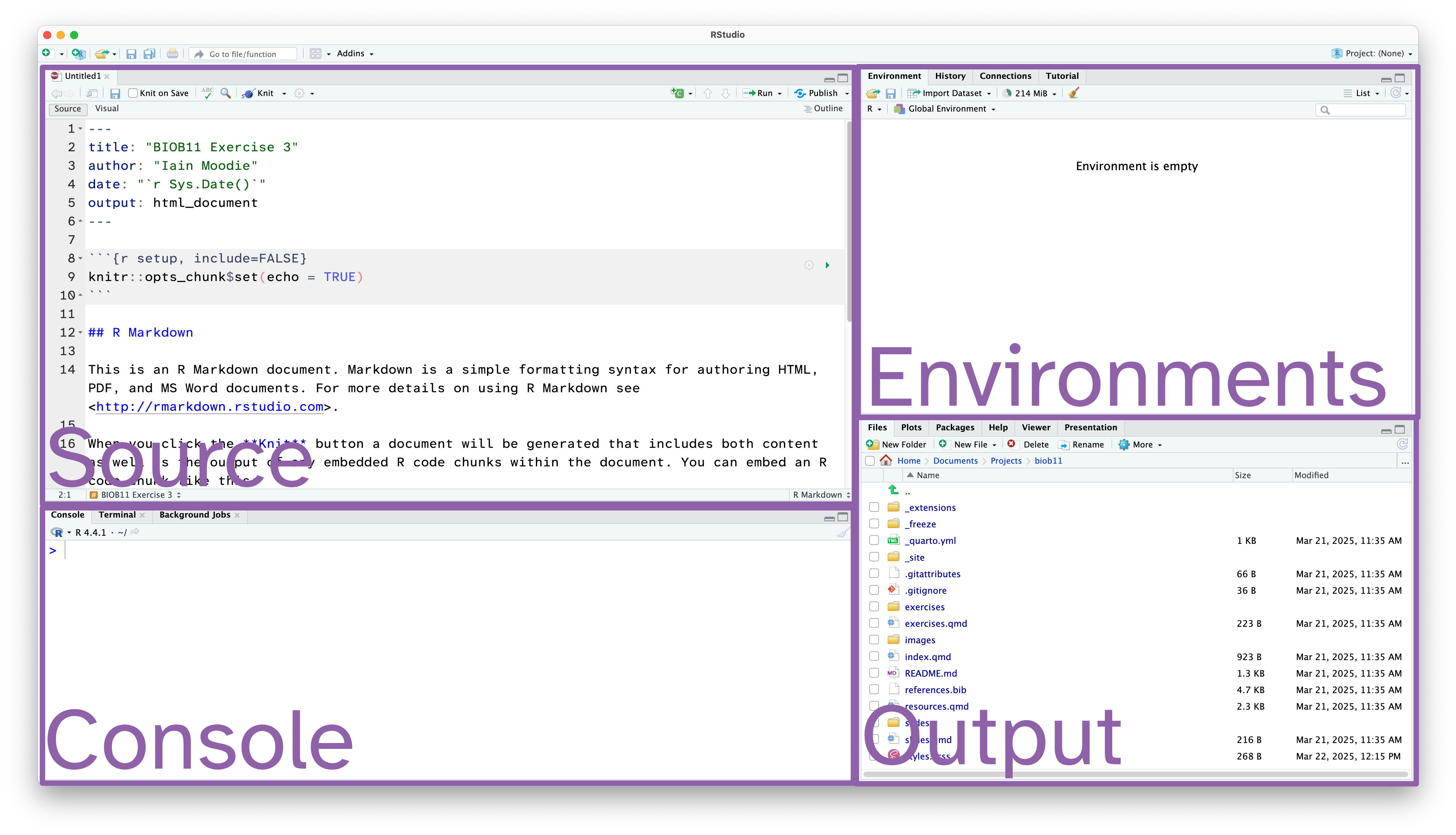
- Source: This is where we edit code related documents. Anything you want to be able to save should be written here.
- Console: the console is where R lives. This is where any command you write in the source pane and run will be sent to be executed.
- Environments: this panel shows you objects loaded into R. For example, if you were to assign a value to an object (e.g.
x <- 1), then it would appear here. - Output: this panel has many functions, but is commonly used to navigate files, show plots, show a rendered RMarkdown file or to read the R help documentation.
RMarkdown
RMarkdown is a file format for making dynamic documents with R. It combines plain text with embedded R code chunks that are run when the document is rendered, allowing you to include results and your R code directly in the document. This makes it a powerful tool for creating reproducible analyses, which are extremely important in science.
The RMarkdown document you opened has some example text and code. An RMarkdown document consists of three main parts:
YAML Header: This section, enclosed by
---at the beginning and end, contains metadata about the document, such as the title, author, date, and output format.Text: You can write plain text using Markdown syntax to format it. Markdown is a lightweight markup language with plain text formatting syntax, which is easy to read and write.
Code Chunks: These are sections of R code enclosed by triple backticks and
{r}. You can click the green arrow to run all the code in a code chunk, or run each line of code using the Run button, or by usingCtrl+Enter(Windows) or Cmd+Enter (macOS)When the document is rendered, the code is executed, and the results are included in the output.
Notice at the top left of the Source panel, there are two buttons: Source and Visual. These allow you to switch betwee two views of the RMarkdown document. The Source view is what you are looking at, and it is the raw text document. You can also use the Visual view, which allows you to work in a WYSIWYG (what you see is what you get) view, similar to Microsoft Office or other text editors. This “renders” your markdown code for you while you write. It also gives you a series of menus to help you format text, which means you do not need to learn how to write markdown code (although it is extremely simple, and you likely know some already).
Which ever view you prefer (and you can switch as often as you like), the code part stays the same. It is primarily there for editing the text around your code.
Important settings
Before we go any further, we need to change some default settings in RStudio.
While we are here, if you wanted to change the font size or theme, you can do that in the Appearance tab.
RStudio also has screenreader support. You can enable that in the Accessibility tab.
Working directory
I strongly recommend you create a folder where you save all the work you do as part of this section of the course. I also recommend you make this folder in a part of your computer that is not being synced with a cloud service (iCloud, OneDrive, Google Drive, Dropbox, etc). These services can cause issues with RStudio. You can always backup your work at the end of a session.
Notice that now in your Output pane, in the files tab, you can see the contents of your folder (which is probably nothing currently). Let’s change that.
Saving your document
Let’s save this example RMarkdown document that RStudio has made for us. You do that exactly how you might expect.
The file should have appeared in your Output pane, with the extension .Rmd. You might have to click the refresh button.
Installing R packages
In this section of the course, we will use the tidyverse package, and the infer package. To install them you need to use the install.packages() function. Since we only need to do this once per computer, we should run this function directly in the Console panel.
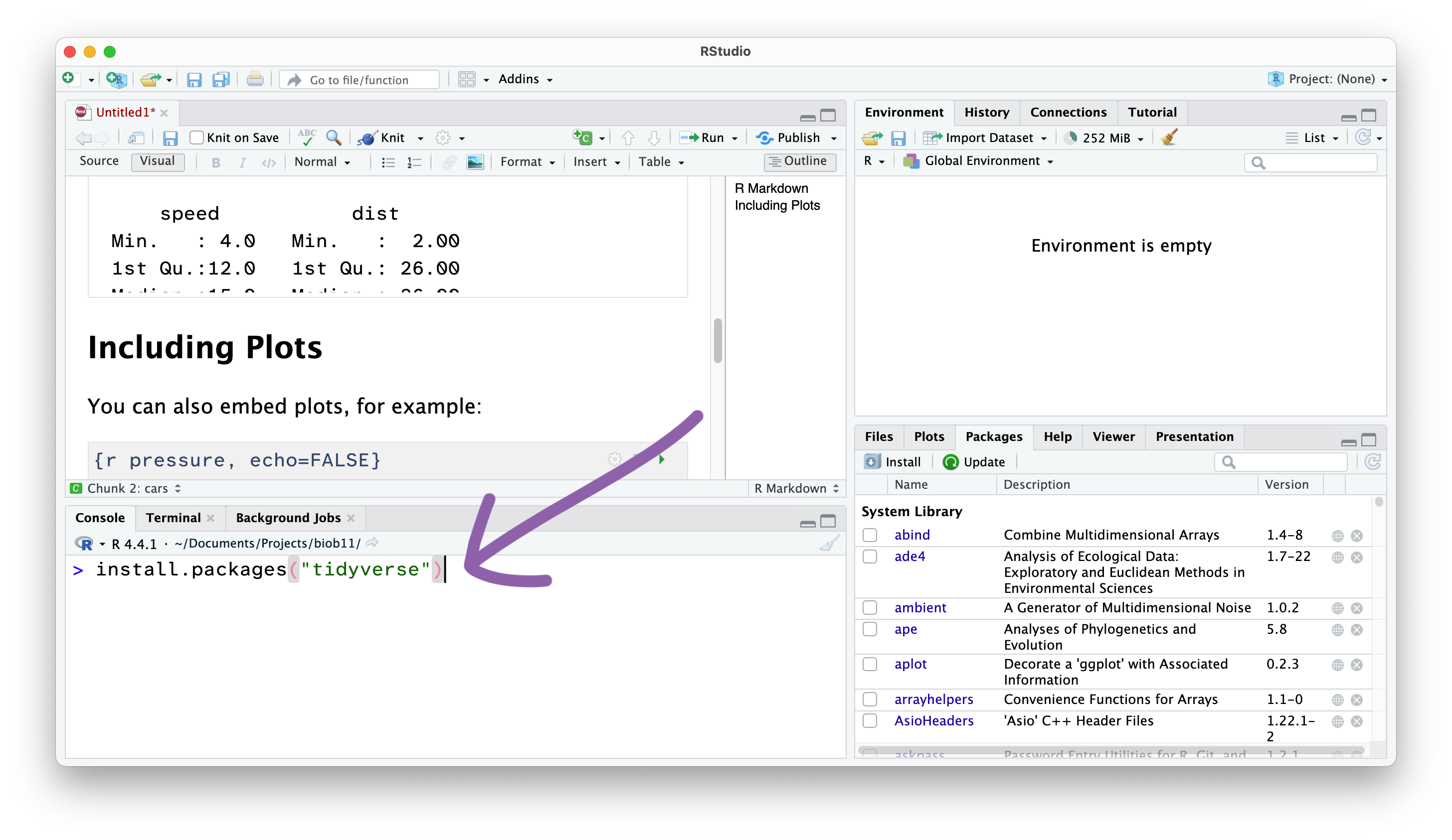
From now on, we won’t write things directly in the Console, and instead write code in the RMarkdown document in the Source panel, which we then “Run” and send the Console.
Delete the demo text
When you make a fresh Rmarkdown document, it comes with some text and code to demo the features. We want to remove that before continuing.
Creating code cells
Code cells are where we write code in an RMarkdown document. This allows use to write normal text outside these sections.
NoteVisual view
To do that in the Visual view (where the text is rendered), go to Insert -> Executable Cell -> R.
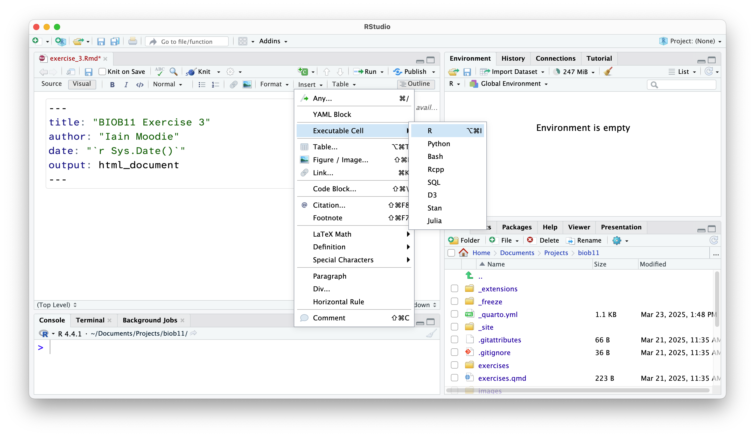
In both views, you can also use the shortcut Shift-Alt-I or Shift-Command-I.
Adding headings and text
Anywhere outside a code cell you can write normal text. In this course, you might find it helpful to write yourself notes alongside your code, so that you can come back to your notes during other exercises, the exam (open book), the group project, or later in your studies.
Along side normal text, you can structure an RMarkdown document using headings.
NoteVisual view
Change the type of text you are typing in the menu at the top:
Loading R packages
After installing an R package, we need to load it into our current R environment. We use the library() function to do that. Since we need this code to run every time we come back to this RMarkdown document, we should write it in the document. R code should always be executed “top to bottom”, so this bit of code should come right at the start.
If that worked, you will get a message that reads something similar to:
── Attaching core tidyverse packages ──────────────────────── tidyverse 2.0.0 ──
✔ dplyr     1.2.0     ✔ readr     2.2.0
✔ forcats   1.0.1     ✔ stringr   1.6.0
✔ ggplot2   4.0.2     ✔ tibble    3.3.1
✔ lubridate 1.9.5     ✔ tidyr     1.3.2
✔ purrr     1.2.1
── Conflicts ────────────────────────────────────────── tidyverse_conflicts() ──
✖ dplyr::filter() masks stats::filter()
✖ dplyr::lag()    masks stats::lag()
ℹ Use the conflicted package (<http://conflicted.r-lib.org/>) to force all conflicts to become errors
This message tells us which packages were loaded by the tidyverse package, and which functions from base R (the functions that come with R by default) have been overwritten by the tidyverse packages. Not all packages produce a message when they are loaded (for example, infer did not).
Let’s move onto working with some data!
A walkthrough analysis
Today we will work with a dataset called tephritis_phenotype.csv. The dataset comes from a study conducted at Lund University by Nilsson et al. (2022).
Background
The dataset describes morphological measurements (lengths, widths of different body parts) of the fly Tephritis conura. This species has specialised to utilise two different host plants (host_plant), Cirsium heterophyllum and C. oleraceum, and formed stable “host races”. Individuals of both host races were collected in both sympatry (where both Cirsium heterophyllum and C. oleraceum host plants co-occur) and allopatry (where only one Cirsium species occurs) (patry) from eight different populations in northern Europe (region) from both sides of the Baltic sea (baltic). Individuals were measured after having been hatched in a common lab environment. One female and one male (sex) from each bud was measured. The authors took magnified photographs of each individual, and of the wings of each individual.
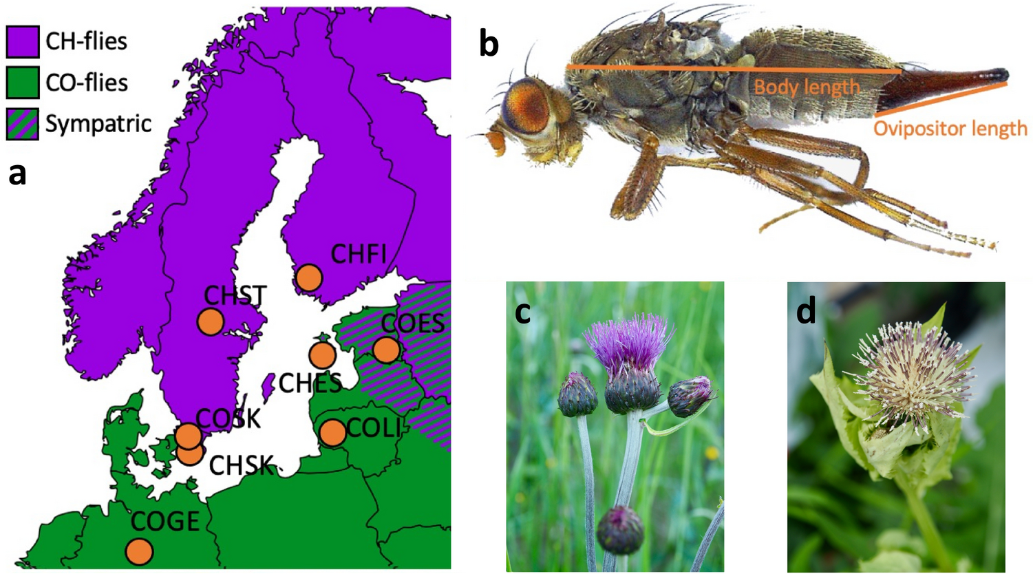
Measured traits included the length of a wing (wing_length_mm), the width of a wing (wing_width_mm), the amount of the wing that was melanised (melanized_percent), the length of the body (body_length_mm) and the length of the ovipositor (ovipositor_length_mm).
Importing data
We will now load the tephritis_phenotype.csv data file that you downloaded earlier. A .csv file is a file that stores information in a table-like format with Comma Separated Values. A typical .csv file will look something like this:
species,height,n_flowers
persica,1.2,12
persica,1.5,18
banksiae,2.4,3
banksiae,1.7,8
.csv files are especially suited to storing data that can be used across a wide variety of programs, as everything is stored as plain text.
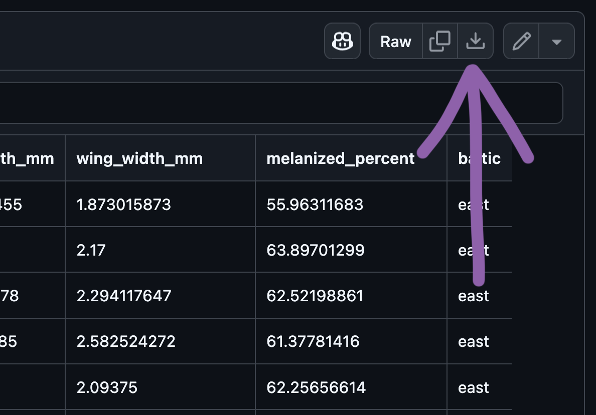
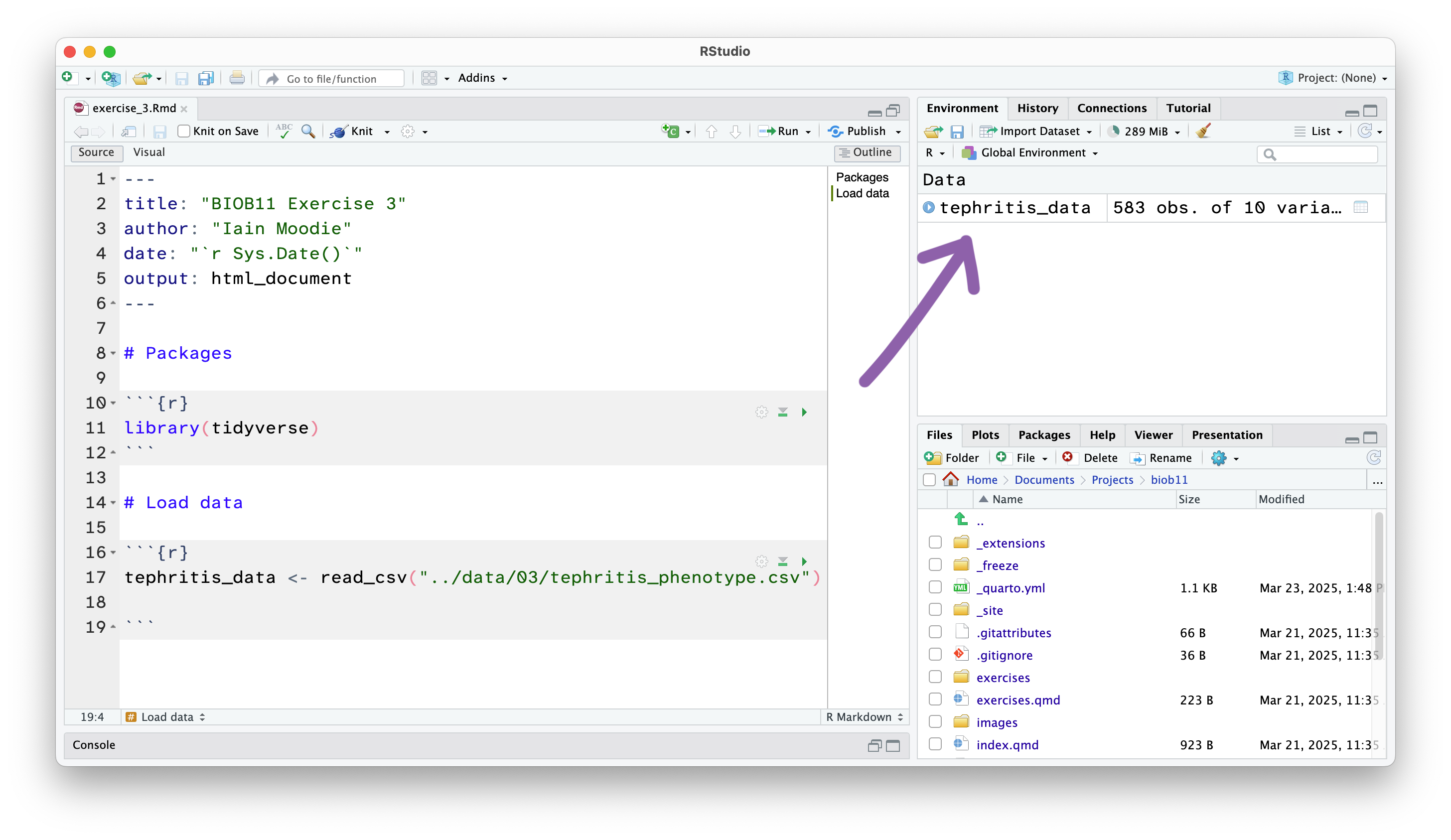
This has loaded a copy of the data from tephritis_phenotype.csv into R. Notice that the object tephritis_data has also appeared in the Environment panel.
Exploring data
This will open the dataset using the RStudio function View() (which if you look in your console, you will see it has just run). This allows you to view the dataset as a table, like you would in a spreadsheet software like Microsoft Excel. Note however, there is no way to edit the data in this view. This is by design. Any editing of the data needs to be done in the RMarkdown document with code. That way, you can keep a record of any edits you make, without touching the original data file.
The research question
One of the questions that Nilsson et al. (2022) were interested in was if there has been any morphological (size of body parts) divergence between the host races of these flies. In other words, do flies that use "heterophyllum" as a host_plant and flies that use "oleraceum" as a host_plant differ in some predictable way?
Let’s use the variable ovipositor_length_mm to explore this research question.
Filtering the dataset
First, we should filter() our dataset to only contain females (as only females have an ovipositor). filter() is a function that let’s us write conditional statements that only allow rows that meet those conditions to “filter” through. For example, we can use filter() to only allow rows where sex == "female" to filter through, thereby creating a new dataset of just female flies.
Notice that a new object appeared in your Environment tab called female_data. By using the <- operator, we have saved the filtered dataset so we can use it later.
Exploratory plot
Often before we start any formal statistics, we want to plot our data.
R has a built in method to make plots, but here we will use a different approach. Instead we will use ggplot2, a plotting package that is installed with tidyverse. ggplot2 provides a clear and simple way to customise your plots. It is based in a data visualisation theory known as the grammer of graphics (Wilkinson 2013).
NoteThe grammer of graphics
The grammer of graphics gives us a way to describe any plot.
A ggplot2 plot has three essential components:
data: the dataset that contains the variables you want to plotgeom: the geometric object you want to use to display your data (e.g. a point, a line, a bar).aes: aesthetic attributes that you want to map to your geometric object. For example, the x and y location of a point geometry could be mapped to two variables in your dataset, and the colour of those points could be mapped to a third.
ggplot2 uses a layered approach to the grammer of graphics. This makes it very easy to start contructing plots by putting together a “recipe” step-by-step. Let’s walk through an example.
In our case, we want to plot ovipositor_length_mm for each host_plant group. One example might be a boxplot:
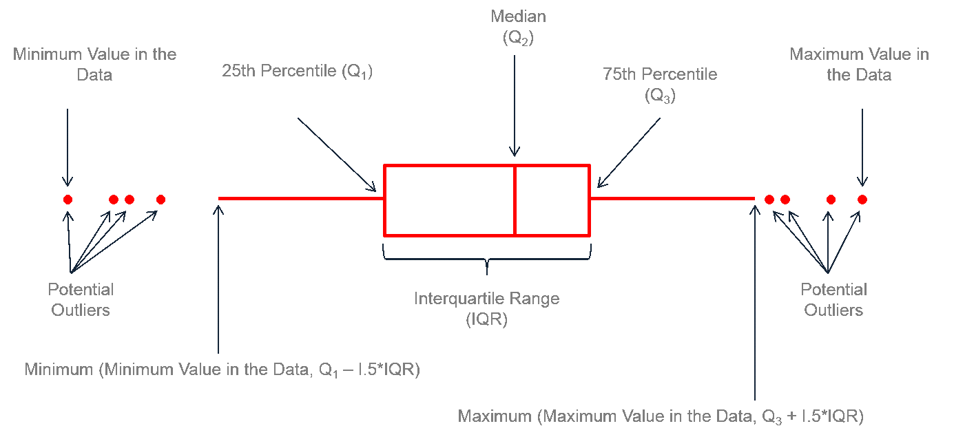
- 1
-
Inside the
ggplot()function, I specify the dataset asfemale_data - 2
-
I map the
host_plantcolumn to the x axisaesthetic and theovipositor_length_mmto the y axisaesthetic. - 3
-
To add layers to a
ggplot()object, we can use a+ - 4
-
I add a boxplot
geometry, that will use theaesthetics I specified before.
Calculating the observed statistic
Our research question is:
- Do flies that use
"heterophyllum"as ahost_plantand flies that use"oleraceum"as ahost_plantdiffer in theirovipositor_length_mm?
The question concerns a difference in a continuous variable between two groups (host_plant). Let’s start by exploring if there is a difference in the central tendancy of ovipositor_length_mm in the two groups. That is, does average ovipositor_length_mm differ between them?
A suitable statistic that captures our question could be a difference in means.
\[ \bar{x}_{\text{heterophyllum}} - \bar{x}_{\text{oleraceum}} \]
We are going to do that using the infer package we loaded at the start.
To use infer to calculate an observed statistic, we use the approach we covered in the lecture:

In code, that looks like this:
- 1
-
Using the dataset we just made, we pipe
|>it into the next line. - 2
-
We
specify()which columns we are interested in, and which is our response variable, and which is our explanatory variable. In this case, we want to explainovipositor_length_mmusinghost_plant, and express that as a"diff in means". - 3
-
We
calculate()our chosen statisitc"diff in means", and we say that the subtraction should be"heterophyllum"minus"oleraceum". - 4
-
We assign this to a new object called
obs_stat.
Quantifying uncertainty
If we took another sample (that is, if we repeated the field work that Nilsson et al. (2022) did), it is unlikely that we would get exactly the same observed statistic, just due to chance. We want to quantify this effect. In this exercise, we will use a 95% confidence interval to do that.

Generating a simulated sampling distribution
We have already calculated our observed statistic, so let’s generate a sampling distribution using bootstrapping.
Recall from the lecture that a bootstrap sample is generated from the original dataset by resampling (randomly selecting rows) it with replacement (we can select the same row more than once). To complete one bootstrap sample, we resample with replacement until we have the same number of rows of data that were in our original dataset.
We then calculate our statistic using the bootstrap sample. This can then be repeated many times to construct a sampling distribution, which show the range of statistics we think it would be possible to observe, if we had actually sampled our population again.
To do that in code, we write the following:
- 1
- Notice how this is almost identical to the code we used to get the observed statistic, but we have one extra step, where we generate 10000 bootstrapped datasets, then calculate the diff in means for all of them.
- 2
-
We assign this to a new object, called
sampling_dist
Confidence intervals
We can use the percentile method to calculate a confidence interval. To do that we take the middle 95% of the bootstrapped sampling distribution. Again, infer has a helpful function to do this for us.
Testing a hypothesis
While our confidence interval is one way to address this question, we can also address it through “null hypothesis testing”. A null hypothesis test tests if flies that use "heterophyllum" as a host_plant and flies that use "oleraceum" as a host_plant differ in their ovipositor_length_mm more so than is expected by chance.

To do that we need to construct a null and alternative hypothesis.
NoteConstructing a null hypothesis
A null hypothesis posits that the explanatory variable we test does NOT affect our data. We then test if our data is sufficiently different from the null hypothesis such that we can reject it.
A null hypothesis does not have be defined by a “zero effect”. For example, it could be that
NoteConstructing an alternative hypothesis
Opposite of the Null hypothesis (the explanatory variable affects our data). We normally think in terms of an alternative hypothesis.
Generating data assuming the null hypothesis is true
As we did in the lecture, we will use a shuffling or permute method of creating a sampling distribution compatible with our null hypothesis.
To do that with infer, the code looks like this:
- 1
-
Again, the code looks very similar, but now we have added an extra
hypothesise()step, where we declare our null hypothesis to be that theresponseandexplanatoryvariables are independent of each other. - 2
- We generate 10000 permutated datasets under this hypothesis, and calculate the statistic for each dataset
- 3
-
Save as an object called
null_dist
P-value
Recall that we want to answer the following question:
Are flies that use
"heterophyllum"as ahost_plantand flies that use"oleraceum"as ahost_plantdiffer in theirovipositor_length_mmmore so than is expected by chance?
To help answer it, we can calculate and visualise a p-value, which is a probability of observing our original statistic, or one more extreme, assuming the null hypothesis is true.
Using our null distribution, we can take our definition above, and simple count the number of times we found an absolute difference in mean as great (or greater than) our observed test statistic, and divide that by the total number of statistics in our null distribution:
\[ p = \frac{\text{Number of times } |\text{null statistic}| \geq |\text{observed statistic}|}{\text{Total number of null statistics}} \]
This is a two-sided p-value.
When you get to this stage, let the teacher know so that we can discuss your findings!
Submit your work!
Note✅ Final task
Knit your document to a HTML file. This produces a document that shows your text, code and the output of your code all in one document.
It will have been saved next to wherever your .Rmd file is saved.
Upload your .html file as your assignment for this exercise in Canvas.
References
Nilsson, K. J., M. Tsuboi, Ø. H. Opedal, and A. Runemark. 2024. Colonization of a Novel Host Plant Reduces Phenotypic Variation. Evolutionary Biology 51:269–282.
Nilsson, K., J. Ortega, M. Friberg, and A. Runemark. 2022. Morphological measurements of two host specialists of the dipteran Tephritis conura, both in sympatry and allopatry. Dryad.
Wilkinson, L. 2013. The Grammar of Graphics. Springer Science & Business Media.